WELCOME !!


CHOOSE A CATEGORY:


NEED FREE PHOTOS FOR YOUR MODELS, WEBSITE, BLOG OR DESIGNS?


Thursday, June 30, 2011

GETTING STARTED...

Oil Painting Lessons/Demos

Art Lessons
Contemporary Art


Are you just getting started in oil painting but you don´t know what colors to buy?

If you want a simple but effective color palette, check out Mikki Senkarik's Double Primary Palette:

MIKKI SENKARIK'S PALETTE

I am honored that Mikki has been generous enough to allow me to share her pages with you.

Thank you, Mikki!!

God Bless !!!

Beatriz Socorro


Thursday, June 23, 2011

Free Photos - FLOWERS A2

FREE PHOTOS


MY GARDEN
Photos by Beatriz Socorro

RED ROSES


2


YELLOW ROSE


GAZANIAS


2

 3

4

HYDRANGEAS


2

3


YELLOW ALLAMANDA


2

Pinta


MORNING GLORY


2


VINCA


CANNA LILIES

2

3

APPLES


AVOCADOS


I hope you enjoy them.
God Bless !!


ART STUDIO

Painting Lessons/Demos
Contemporary Art


MY STUDIO


The Garden


Canelita


Pinta in "Dog Heaven"


Beatriz Socorro

Monday, June 20, 2011

FREE ART LESSONS

Art Lessons
Contemporary Art


FREE ONLINE  DRAWING AND PAINTING LESSONS

TO SEE  MY STEP-BY-STEP OIL PAINTING DEMOS, GO TO: OIL PAINTING DEMOS

I will also be adding just a few links to other artists  that  I think might be really helpful to you.

Here are some useful links for those who are just getting started in oil painting:

- This site is loaded with free step-by-step drawing lessons. Check the links listed under "individual lessons".  They have basic, intermediate and advanced levels. You will definitely learn how to draw just by following these free lessons. They also have online classrooms for a fee.

Drawspace

- This site is loaded with great information in different painting mediums: oils, acrylics, watercolor, pastels, etc.. Also loaded with demos by excellent artists. You will benefit much by visiting this site.

CreativeSpotLite


- A basic guide to artist´s brushes plus a lot more...great site!!

Bill Martin´s Guide to Oil Painting

- Basic composition made simple and, even though their medium is watercolor, be sure to also check their "Free Art Tips". You will find it very helpul.

Paintdoodles

- I highly recommend you follow Mikki Senkarik who not only is one of my favorite artists but also has a blog with demos and very useful information. I have learned much from her and continue to do so. I suggest you start with the oldest blog and work your way up.

Mikki Senkarik

- And if you haven´t done so already, be sure to check out  Artgraphica. Loaded with useful information and tips in a variety of mediums.

Artgraphica


Be sure to add me to your favorites or follow by e-mail. Visit regularly and check the archives, since I will be constantly adding new demos and more free photos.

Enjoy and God bless !!

Beatriz Socorro

OIL PAINTING TIPS

Oil Painting Lessons/Demos

Contemporary Art


PAINTING TIPS


Don´t be discouraged if your first paintings don´t turn out as well as you would like. I wish I had photos of my first attempts at oil painting so that I could show you. They were awful!!!

The good news is you can paint over them   :)


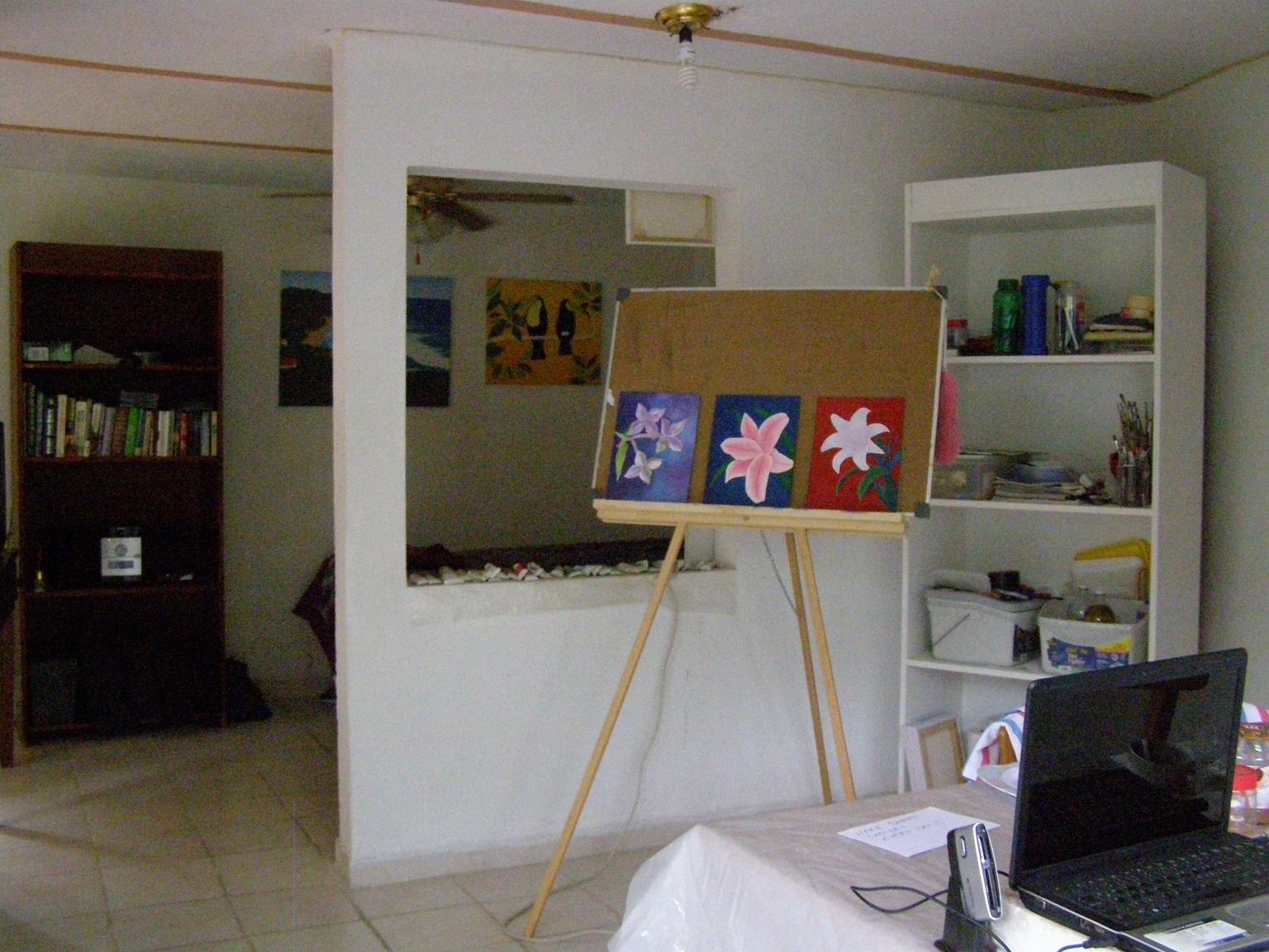
How to Photograph Your Paintings:

The easiest way to photograph your painting is to go outside under a shaded area. Be sure your flash is off. The diffused light under the shade or on a cloudy day is the type of light that portrait photographers try to emulate with multiple lights and reflectors in their studios.

Photographing a painting


One of the advantages of allowing your oil paintings to dry is that when you paint over them, if you don´t like what you see, you simply remove it with a dab of turpentine on a paper towel. Be sure to rub gently, otherwise you could damage the preceding layer of paint.

Be glad when you make a mistake. When I worked as a photographer, it was when I made mistakes that I learned the most. When you make a mistake, don´t degrade or punish yourself but rather observe your mistake closely. You will be amazed at what you´ve learned and will never forget what you learned . Mistakes are not a failure nor an enemy...they are your best learning tool.

Framing: If you plan to frame your painting, be sure to leave enough space along the edges of your canvas for that purpose. 

Mixing Colors: To avoid "muddy" colors, don´t mix more than three different colors at a time.

I have spent days mixing different colors on waxy paper. I make sure I write down the colors I have mixed and save them (otherwise, I will surely forget). Even though making color charts is time consuming, in the long run it actually saves you an incredible amount of time. When I need a certain color, I just look at my color charts

Just a few of my mixed color charts

Keep a Log: I keep a log of each painting in which I jot down the colors I have used for the background, flower, stems. etc.. This way, when I return to a painting, I don´t run the risk of forgetting what colors I mixed.

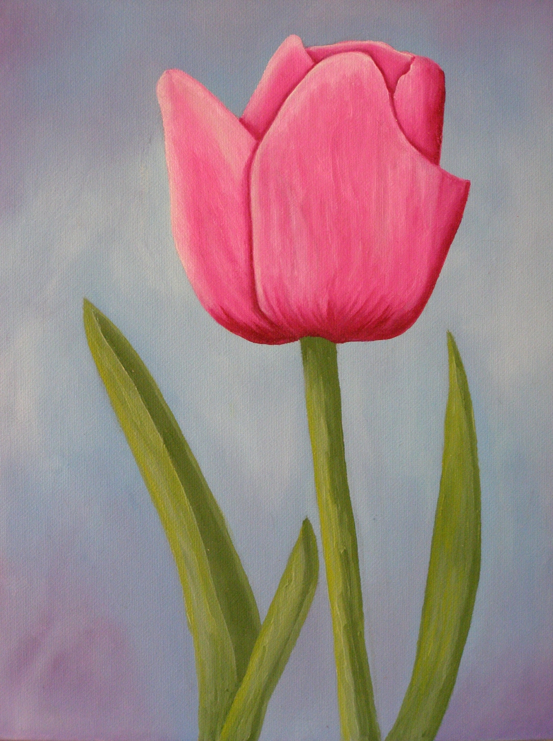
I actually work on more than one painting at a time. While I was painting this tulip I was also working on six more paintings. While one is drying, I work on another.

Fat-Over-Lean:  When you paint in layers, one of the basic rules is "fat-over- lean". This rule does not apply when you´re painting wet-on-wet or alla prima.

While an oil painting is drying ( I have read that the drying process can take up to a year and sometimes even more), the underlying layers will absorb the oil from the subsequent layers. This will result in the cracking of the paint. I learned this the hard way when I first started painting with oils. So, unless you purposely want the "cracked look", be sure to follow this rule.

The mixtures I use as a medium (at this time) are:

First Layer: 3 tablespoons turpentine + 1 eyedropper damar varnish + 1 eyedropper linseed oil.

Second Layer: 3 tablespoons turpentine + 3 eyedroppers damar varnish + 3 eyedroppers linseed oil.

Third Layer: 3 tablespoons turpentine + 3 eyedroppers damar varnish + 5 eyedroppers linseed oil.

Fourth Layer: 3 tablespoons turpentine + 3 eyedroppers damar varnish + 7 eyedroppers linseed oil.

Notice that in this mix the only thing that changes (with the exception of the first layer)  is the Lindseed Oil, which is applied in increments of 2 eyedroppers of Linseed Oil for each additional layer.

I have four different containers in which I have pre-mixed the medium.

I have them labeled as: Layer 1, Layer 2, Layer 3 and Layer 4.
 
What is a "wash"?  A wash is paint that has been highly thinned with turpentine. Put a little bit of paint on your palette, use the eyedropper or your brush to add turpentine and mix. Add enough turpentine to make it almost transparent.

Why do painters use washes? There are several reasons:

1. Some use it to give an underlying color-unity to the painting, in which case the same color wash is applied to the entire canvas.
2. Others use it to define the light and shadow areas in their painting.
3. Others use it as the first step (imprimatura) in a technique by which a painting is done in layers.
4. Others use it to affect the tonality and hue of the colors that will be used in the subsequent layers.
5. Others use it so that the white from the canvas does not show through, should they happens to miss a spot, which is the reason why I am using it for these first demos."

What is glazing?   Check this link:  Glazing

Scumbling: Scumbling is a technique by which you "rub" the paint in either with a clean brush, your fingers, a piece of cloth or whatever else you might come up with.
For a more detailed explanation go to Rose Demo 1

Brush Basics: The best way to learn to use your brushes and palette knifes is to use them and see what different effects you get from them. You can even paint with your fingers, your toes, your nose. Experiment !!!

To get a basic understanding of your brushes (and a lot more), the best place is Bill Martin´s link:

Bill Martin´s Guide To Oil Painting

Thank you, Bill.

Brushstrokes: If you enlarge my photos you will see that if it´s an ocean, the strokes are horizontal. Clouds are curved strokes. Walls are vertical strokes. Let your brushstrokes follow the natural shape of your subject.

However, that does not mean that one day I will not break this rule (tool of the trade). That´s the beauty of art...rules are just tools.  It just depends on what effect I wish to get at the moment or if I just want to experiment and see what happens.

How do I hold my brushes? Whichever way is most convenient and comfortable at the time.

Palette:  I mix my paints on a white, Corel dish. They are cheap and easy to clean.

Easel: I never paint on an easel, even though I own one.

I paint sitting on my bed, or leaning over the dining room table or sitting on a chair with the painting on my lap. Of course, I first cover everything well with plastic sheets.

Storing left-over paint: I use a glass plate that fits into a round Tupperware container. I place the paint on the plate, place the plate in the container, add enough water to cover the paint and put the lid on the container. The reason for using a glass plate is so that it won´t float. The paint will keep for a couple of days.

Cleaning Brushes: I clean them first with turpentine and then with a mild mixture of dish-washing detergent. Rinse, wipe and set them horizontally to dry.

To avoid transferring paint accidentally unto the canvas, I always work from the inside out or from the top down.

This is also one of the reasons why  I like to let everything dry well before going to another step. This way if I get unwanted paint on the dry areas, I can remove it with a dab of turpentine on a paper towel. Be sure you also dry off any excess turpentine.

Another reason why I like to let the paint dry  before going to the next step, is to avoid blending more than three colors at a time. To do so could result in "muddy" colors.

About Liquin:  I am very messy when I paint. I get paint on my hands, arms, legs and face (which is one of the reason I am reluctant to use  Liquin).

A few years ago I visited a forum where an artist was complaining as to why the manufacturers did not add the ingredients of Liquin to the label. He wanted to know what he was working with and why the manufacturer´s were not telling. Of course, at the time no one had the answer.

That was some years ago. Now they do include the ingredients to their labels. Liquin contains: 2 - butanone oxime. To read about the hazards of this chemical,  go to:

1. chemcas.com
2. CDC.gov
3. Canadian Gov. Chemical Substances

If you would like to receive my future free painting lessons, demos and  photos, please sign-in where it says follow by e-mail or just add me to your favorites and check in each week to see what´s new.

God bless...

Beatriz Socorro

Sunday, June 19, 2011

ART NOTES

Oil Painting Lessons/Demos

Art Lessons
Contemporary Art


ART NOTES

There´s only one Master Artist. Not even Michelangelo nor DaVinci nor any of the greats came even close to the Master´s works of art. We can only be satisfied to strive to do our best when we join in the creative process...and even then, we´re puny in comparison.

When I paint, I try to allow the spirit within to do as it pleases. The beauty of art is that, in spite of all the rules (which in reality are only tools of the trade), there are no rules. You can break, bend, twist, disregard and even use "the rules." It just depends on what effect you want to achieve at the time.

Have you noticed that the greatest artists of our time, such as the Impressionists, Picasso, Dali... are precisely the ones who broke the rules?

You can make the drawing and the colors as close to nature as you possibly can or you can simply let your imagination fly and create your own. In the creative process and in the realms of imagination, anything and everything is valid.

I don´t have a limited palette. I have about 30 colors and I hope to buy even more and use them all. I have all kinds of brushes and palette knifes.

I hope I never settle for just one style or color scheme because to do so would also imply putting limits on the creative process.

When I start to paint, I start with an idea but could actually end up doing something completely different than what I originally had "in mind."

I don´t paint when I really don´t "feel" like it. I believe that when we paint we leave a part of our energy and spirit on the canvas. That´s why so many artists, including myself, feel that their paintings are their "babies". In a way, they are.

I also believe anyone, with a sincere desire to do so, can paint. Before any of us could read or write, we could paint. I believe it´s an innate ability in all of us. Perhaps, it´s God´s way of letting us share in the joy of the creative process.

What is Fine Art?  Click the following link to see some definitions:

Fine Art Definition

God Bless !!!

Beatriz Socorro

Tuesday, June 14, 2011

TULIP DEMO

Painting Lessons/Demos
Contemporary Art


Oil Painting Lesson/Demo
by Beatriz Socorro

Beatriz Socorro - Pink Tulip

Before you begin, please go to and read:


STEP 1 - The most important and most time-consuming step for me is deciding what I am going to paint and which colors I'm going to use.  Once this is accomplished, half the work is done.

For reference, I have a vast collection of  photos which I have taken throughout the years as well as public domain photos that I have found while surfing the Internet. I browse through these until I have found the ones that call me.

Once the subject matter has been settled,  I sketch it first on a piece of paper where I also make all the necessary corrections. Once I am satisfied with the sketch, I  trace it unto the canvas. I use charcoal to trace the drawing. Since the charcoal tracing will smear all over the canvas when I apply the paint, I  go over it with a pencil and then  remove as much of the charcoal as possible with a paper towel.

For the first layer I use, as a medium,  a mixture of 3 tablespoons turpentine, 1 eyedropper damar varnish, 1 eyedropper linseed oil.

STEP 2 - Fill in the background.


STEP 2 - oil painting demo
STEP 3 - Fill in the dark, medium and light colors of the flower.


STEP 3 - oil painting demo
STEP 4 - with very gentle and light brush strokes blend in the colors.

STEP 4 - oil painting demo
NOW ALLOW  THE  PAINT TO DRY TO THE TOUCH BEFORE GOING ANY FURTHER.


STEP 5 - I didn´t like the way the right petal stuck to the center, so I expanded it a little. Then I lightened up the highlights and darkened the shadows. The light is coming from the left.

For the flower, I used a mixture of carmin + white + barely a touch of magenta. The different shades are all from these same colors. If you mix more than three colors at a time, your paint will look muddy.

Now I fill in the leaves using the same procedure as the flower. First the dark, medium and light colors are added and then gently and lightly blended with a brush. For the leaves, I mixed chrome green + white + touch of ceruleum blue.


Step 5 - oil painting demo


Detail Step 5 - detail tulip

For the flower, since this is the 2nd coat, I used a mixture of 3 tablespoons turpentine + 3 eyedroppers damar varnish + 3 eyedroppers linseed oil.

For the leaves, since this is their 1st coat: 3 tablespoons turpentine + 1 eyedropper damar varnish + 1 eyedropper linseed oil.

I then add drop by drop of this mixture to my paint and mix it well, to achieve the consistency I desire. Make sure you dont' over do it, since too much medium can weaken the pigments in your paint.

NOW WAIT FOR THE PAINT TO DRY TO THE TOUCH BEFORE YOU ADD THE FINISHING TOUCHES.

STEP 6 -   In this case, even though I liked the background and even though it looks good on the blog, in real time with room-lighting, the flower lacks contrast and tends to blend with the background. Since this is not the effect I want to achieve at this time, I made a few changes to make the main subject stand out. I added a little bit more white to the highlights and slightly darkened the shadows. I also changed the background to a darker color. Notice that it is even darker around the flower itself. 

Areas with high contrast attract the eye and come forward.

Since I want to achieve a feeling of depth, I barely lightened the shorter leaf. This is another rule of painting...warm colors come forward and cool colors recede.  This is important to keep in mind when trying to convey a 3D feeling not only through light and shadow but also through color.

Since this is the third layer, the medium I used is a mixture of 3 tablespoons of turpentine + 3 eyedroppers of damar varnish + 5 eyedroppers of linseed oil.

It´s also important to realize when enough is enough. I´ve ruined more than one painting because I didn´t  know when to stop.


9x12 oil on canvas board

If this is your first visit, be sure to check the archives.

God Bless!

Beatriz Socorro


BREATHTAKING...

A MUST WATCH !!! I would call this human art... 2014 Nanjing Youth Olympic